
Not everyone is an analytics expert. It’s estimated that only 25% of knowledge workers are using Business Intelligence or data discovery tools. Regardless of business application, the reluctance to begin the journey of analysis in earnest usually sounds like…
“I know what data I want to look at, but I just don’t know the best graph to showcase it…”
“I want to see trends in my data and make comparisons by region, but I have no idea how to display it…”
“Analytics are tough. I just don’t know how to begin to think about how, or where, to even start…”
No problem, that’s easy. You simply need to answer…
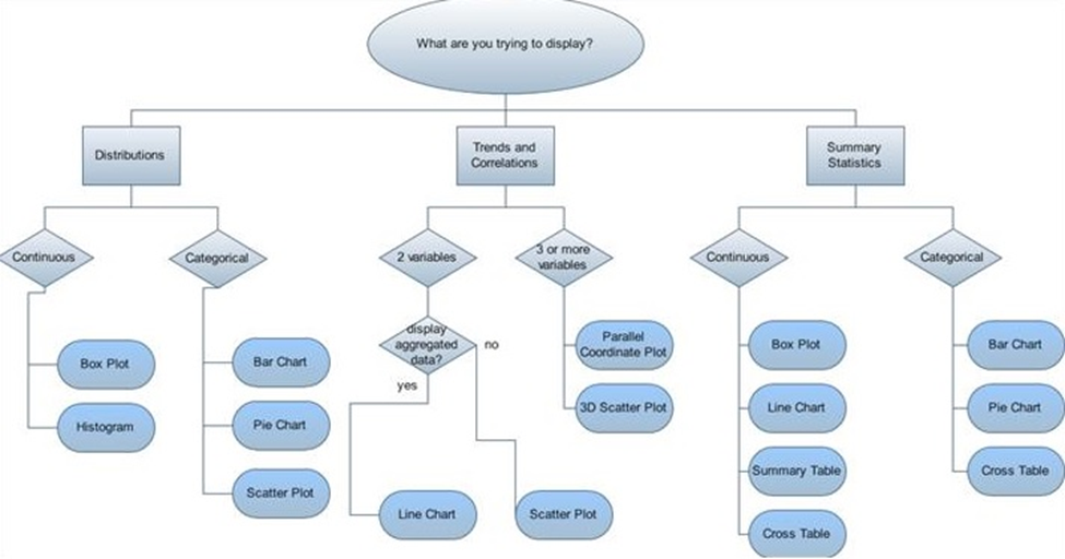
Obviously, this flow chart graphic above is a joke, and a mind-melting, esoteric reminder of the fact that choosing the right visualization is NOT always easy to the uninitiated. Before analysis even begins, it can be stymied by the challenge of how to begin.
Spotfire’s new recommendations just made the journey to discovering value and insights in your data faster and easier.
How’d we do it? By eliminating the manual process of getting started. Recommendations handles the heavy lifting for you with a built-in analytics intelligence wizard as your guide. You select the data you want to explore and Recommendations shows you how to best present it by generating best-practice visualization choices for you.
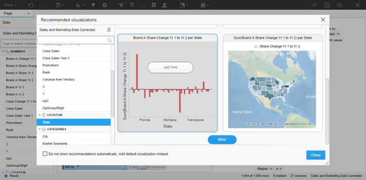
As you select different data, Recommendations instantly updates to show you best-practice choices. When you see your data presented the way you like, you simply select it, and it is added to your workspace where you can begin interacting and exploring. Make as many selections as you like to create a whole dashboard of connected, interactive visualizations—in just a few clicks. It’s that easy!

On the road to data discovery, think of Recommendations like a GPS navigation system for visualizing your analysis: more direct, faster routes to your destination. To extend the metaphor, the next stop is more informed decision-making.


