

Data visualization is extremely effective in helping executives and other users to absorb information and gain new insights into business and operational trends. It opens up new ways for knowledge workers to absorb information. For instance, a study of office workers conducted by Mindlab International at The Sussex Innovation Centre found that when data is displayed more visually, workers are 17% more productive.
But in order for data visualization tools to be widely adopted by organizational leaders and other knowledge workers, they need to be simple to use and easily accessible.
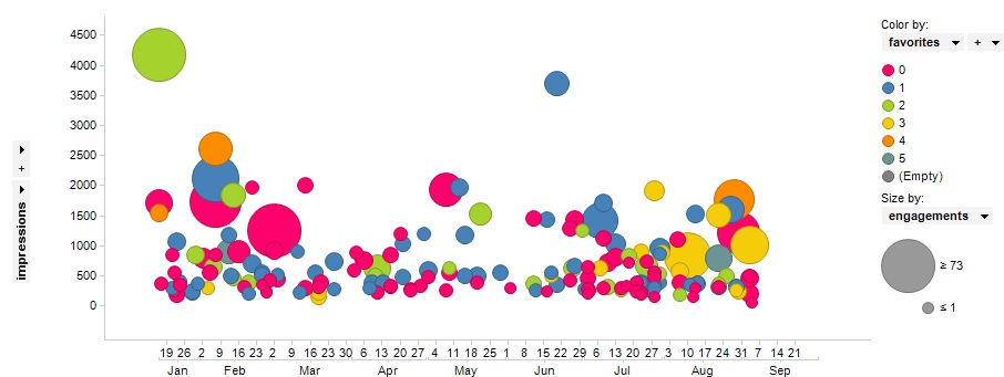
A time series visualization can reveal how sales across key customer groups are trending over time. This can provide LOB leaders with incredible insights into how and why sales are trending in a particular direction with specific target customers that can be used to help shape future marketing and sales strategies.
Some non-tech savvy executives and employees may be apprehensive about using data visualization tools themselves for fear they don’t have the technical chops to use the tools properly. Demonstrating to prospective users how easy data visualization tools can be to use with simple point-and-click interfaces – along with the rich visualizations they’re able to interact with – will likely make would-be users eager to try them.
Showing would-be users how data visualization tools work and how the tools provide users with new and better ways to understand and interact with data is a great starting point for driving adoption. Guided, immersive demonstrations of data visualization tools can unveil new avenues to interaction with data, and ultimately inspire adoption of data exploration and discovery among decision makers.


