Information technology advances – especially the immense processing power of supercomputers – have helped power the mapping of the human genome. This insight into the human body undoubtedly is among the most major advances in scientific research and medicine.
 But while the advantages of being able to crunch large data sets faster are well known, unstructured data like text has been notoriously more difficult to analyze than structured data that can be easily housed and manipulated in a database.
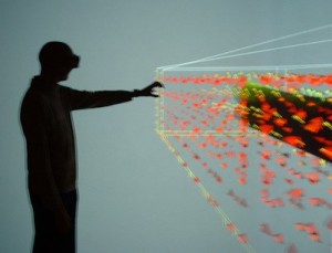
However, technological innovation is enabling researchers to quickly cull through the text of scientific research reports and articles to identify relationships between previously isolated work through data visualization.
For example, researchers can analyze the text of many research papers and look for examples where common features and descriptive terms of a disease are used. And they can apply data visualization tools to unearth correlations between words – and perhaps the diseases themselves – that could not be seen from number crunching.
“Building a hypothesis generator sounds like a sea change that could open up doors in science that no one has even considered,” notes Scientific American. “Imagine isolating many papers based on a subject and having all of the relationships that have never been recognized between them staring back at you in a handy matrix.”
Jeffrey Heer, an assistant professor at the computer science department of Stanford University, adds that data visualization must do more than just turn data into images.
“It is vital that visualizations support interactive exploration and verification, so that one can not only uncover new hypotheses but begin the process of assessing their credibility,” he says.
Ben Shneiderman, a professor of computer science and a founding director of the Human-Computer Interaction Lab at University Of Maryland and a pioneer of the technology that powers Spotfire, notes that statistics alone are “dangerous.” He describes once using data visualization to uncover a crucial error in the analysis of emergency room admissions. It turns out that the statisticians mistakenly included patients who were said to be more than 999 years old.
“A lot of people in the statistics or data mining world don’t take a look at the data to be able to detect these things,” Shneiderman says.
Data visualization is not only being leveraged by scientists, but it has myriad potential business applications as well, notes Forrester Research’s John Brand. As the volume of data firms need to process has grown exponentially, so has the need to quickly communicate the analysis to much broader audiences, Brand points out. In addition to the growing volume of data streaming into corporate networks, the complexity of the data sources and formats requires simple visual interpretation of complex data relationships.
While data visualization techniques may have once been comprised of a chart based on an Excel spreadsheet, integrating data from multiple information sources now might require infographics, interactive bubble charts, three-dimensional data and semantic analysis maps.
“Users now expect that they can completely interact with data, not just visualize it,” Brand says. “Static reports simply don’t cut it anymore. This means that the visualization tools must understand the context of the data and be able to dynamically adapt the navigation, look and feel and even the core functionality as users manipulate and immerse themselves in the information.”


