When most of us get a new data visualization tool or a new version of our visualization software with extra features, we jump at the chance to see what has been added and want to explore more. We use our tools to create a plethora of lines, circular charts, swooshing arcs, and more. Sometimes, we get a little carried away and go overboard with our visualizations.
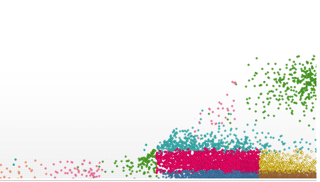
The good news is that sophisticated tools are allowing us to visualize data like never before. It’s pushing the bounds of the amount of data people are able to process. Classic computer graphics and charts simply can’t handle the job of helping us visualize it all. When William Playfair first invented the line and bar charts in 1785, there was no way he could know the impact his creation would have. Now, instead of plotting a few points across a line, we can plot with thousands of points and have to use partial transparency to view the points behind.
With so many choices of data visualizations available, how do you pick the right one that helps business executives understand what you’re trying to portray and allow them to make better decisions? After all, picking the wrong visualization can have your audience saying, “So what?” and not know how to proceed.
Here is a quick list of things you will need to go from playtime to efficiency with data visualizations:
1. Eliminate any unnecessary visualizations and text
Make the data the hero of your presentation. Too often we take the most interesting data and surround it with clutter so it makes it hard to get the point. Whether it is unwanted text, boxes, arrows, or descriptions, keep it clean to get your point across.
2. Find the visualizations that are the best fit for your data
When in doubt, use your software’s wizard–like the Recommendations feature in Spotfire–to guide you through the selection process and pick the right visualization for your data set.
3. Make sure you have your data altitude at optimal calibration
Do the calculations ahead of time and make sure the data is properly formatted.
4. Let your visualizations tell the story and get rid of extraneous text
Take the time to think through what the visualizations will mean for your audience and how you can use the data to tell a better story. Is there a better context you can use to get the point across?
Conclusion
Using these tips, you can move from playtime to efficiency and make the most of your data visualizations. Always keep your story in mind and remove any unnecessary pieces that get in the way. Are your ready to tell your story with your visualizations?
Next Steps
- Try Spotfire and start discovering meaningful insights in your own data.
- Subscribe to our blog to stay up to date on the latest insights and trends in Fast Data and Big Data analytics.


