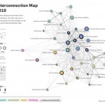
 Check out this blog on VizWorld showing an ultra cool use of visualization from The World Economic Forum. The Risk Interconnect Map (RIM) 2010, while very cool, is very serious use of data analytics, risk, and visualization. This map shows the risks to everyday life as we know it. The map breaks world risk down by data points including:
- Percent likelihood of occurrence
- Cost severity in US$ Billions
- The Risk Landscape (mapped to severity and likelihood)
- Connection strength (between risks)
The map also indicates the level of risk by domain, including by:
- Economics
- Geopolitics
- Environment
- Society
- Technology
We can’t remember the last time we were so excited to see a use of technology that forecasts bad things (not counting the weather…).


