 As they say, a picture speaks a thousand words; when working with complex and/or scientific data, this is especially true. Often, data visualization in business intelligence is used for very corporate applications. But in truth its applications are limitless.
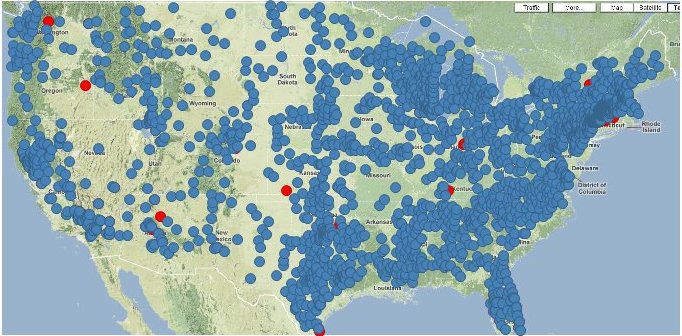
Take the H1N1 “swine” flu pandemic. The World Health Organizations, Center for Disease Control and other organizations have and track statistics on the spread of H1N1. But amid the hype, fear and uncertainty it’s hard to grasp the magnitude of the pandemic. That’s where data visualization can come in.
Using data visualization software with dynamic aggregation and filtering, we can easily see how H1N1 has spread throughout the U.S.
Makes a bigger impact than simply hearing or reading that there were 50,000 cases after 19 weeks, doesn’t it?


