

In this tip, we’re going to look at visualizing geospatial data using the distance from a specific point on a map. We’ll draw a circle around the point using a user-specified distance. We’ll then group the data based on its distance in order to perform a segmentation analysis.
First, big thanks to Nick Merritt and Ian Cook from the TIBCO Analytics team for providing the foundation scripts and examples for this Tip! Thank you!
For this example I’ll be using open data from IRS.gov which includes aggregate tax return data for every zip code for the tax year 2012. (This is a remarkable dataset to explore if you’re curious about geographic income distributions. It includes aggregated zip-level data for all the boxes on the 1040.)
Here are the pieces that we’ll add to our analysis to make this work:
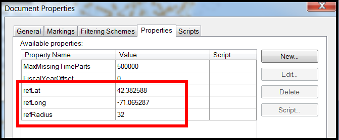
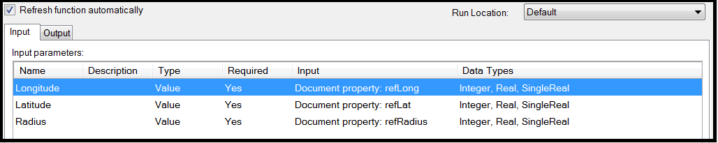
- Three document properties to store the selected Latitude, Longitude, and the user entered circle radius (in miles).
- Two calculated columns: One that computes the distance between locations, and another to show if a location is inside or outside of that distance.
- A button that will allow the user to specify the center of the circle. This button will trigger an IronPython script that will grab the latitude and longitude of the selected location.
- A data function that will create data for a map layer (circlepolygon) at the specified location.
Add the Document Properties
Here are the document properties that will be used to draw the circle. When creating them, be sure to specifiy the data type as “real”. The values will be set when the user adjusts the distance or re-centers the circle.
Create the Calculated Columns
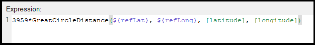
Add a new calculated column named “Distance”. This expression will compute the distance, in miles, between two locations using the GreatCircleDistance function. We’ll use the reference location from the document properties as the starting point since this is the center of our circle. The end point will be the location for the current record. If you’d like the result in kilometers instead of miles change the expression modifier to 6371 instead of 3959.
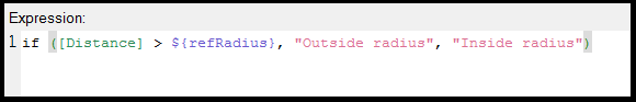
Add a new calculated column named “Within radius”. This column will act as a simple boolean flag to determine if the location is within the current radius.
Create the Property Controls
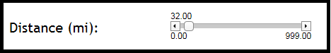
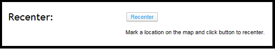
In a text area, add a property control that is attached to the “refRadius” property. Here I’ve created a slider control, but this could also be a free form input or other control type.
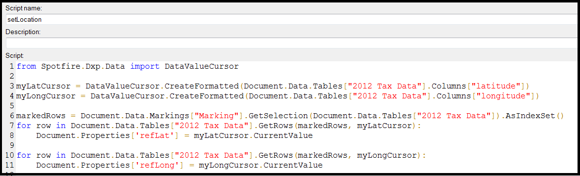
Add a button that will trigger a script to capture the marked latitude and longitude. The script is shown below in a screen shot, or click here for the text version. (This script uses hardcoded names for the analysis-specific marking name, latlong column names, and the datatable….update as needed.)
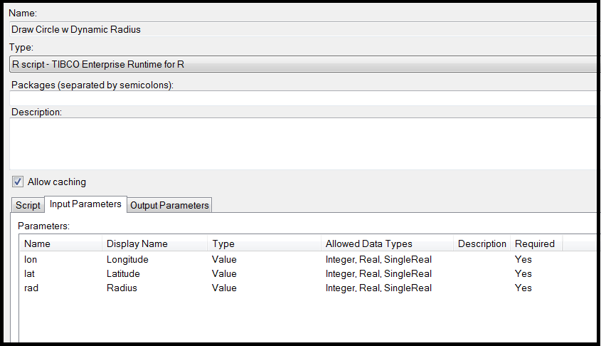
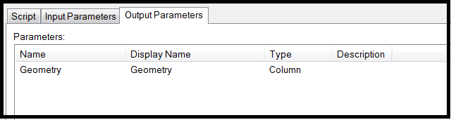
Register the Data Function
Add the data function that will generate the circle map layer. The expected input and output parameters are shown in the screenshot below. This function is written in R and uses Spotfire’s TERR engine for execution. TERR is available and enabled automatically (and transparently) with your Spotfire Desktop or Spotfire Analyst installation. (Rendering the circle on the Web Player will require Statistics Services – if you don’t have this you’ll still be able to segment by distance, you just won’t see the circle boundary.)
The R script can be downloaded here in text format or here in a format that can be imported into the Data Function editor.
Run the Data Function
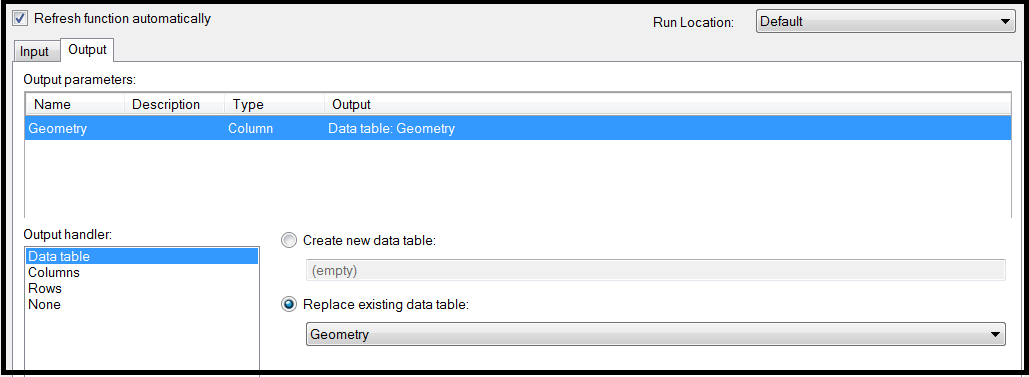
Run the data function by clicking “Run” on the data function editor. It will ask you to specify the input values. Specify the latitude and longitude inputs as the document properties you defined to hold this information. Likewise, for the radius input specify the document property that holds the distance value. For outputs, specify the creation of a new datatable that will be used to plot the new map layer. Be sure to check “Refresh function automatically” so that the circle is re-drawn any time the user changes the distance or re-centers the circle.
Add the Map Layer
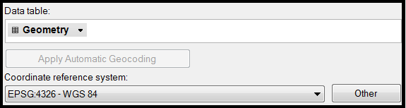
The final step is to add the circle as a feature layer to your map using the new datatable. When adding, be sure to specify the coordinate system as “EPSG:4326-WGS 84”. Once added, you can use the properties of the layer to adjust the color, border and transparency of the circle.
The result….

To download the DXP file for this example, click here (Spotfire 7 format). Or, click here to view online.


