

The Department of Housing and Urban Development (HUD) collects data on homelessness from the US and releases two annual reports to Congress: the Annual Homelessness Assessment Report (AHAR), Parts 1 and 2. Part 1 contains information from the annual Point-in-Time Counts (PIT) conducted by communities nationwide on a single night in January. Part 2 includes information obtained from homeless shelters throughout the course of a calendar year—the Homeless Inventory Count (HIC).
Raw data is available online at data.hud.gov. We obtained PIT and HIC data for 2007-2013 as part of a bake-off with Qlikview, Tableau, and SAS at the annual Gartner BI conference in Las Vegas. The HIC and PIT data are yearly measures across 426 spatial regions in the US—CoCs (Continuums of Care). Estimates of homeless veterans are included beginning in 2011. HUD partners with the VA on the Veterans Homelessness Prevention Demonstration Program.
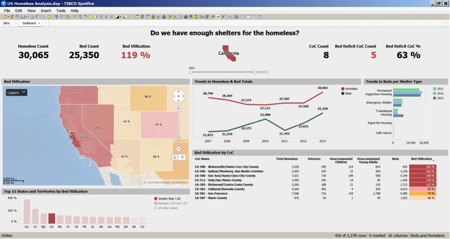
Our analysis of the homelessness data is publicly available on Spotfire Cloud.
This analysis shows that from 2007 to 2013, homeless rates and bed utilization have dropped across the US. In 2013, the average bed utilization across the US was approximately 84%. However, there are still many states and regions that have high homeless rates and high bed utilization.
There are 13 states with average utilization greater than 100% in 2013. See Figure 1 below (bar chart, lower left):

California has the highest count of homeless every year and average utilization greater than 100% for all years (Figure 2 Trends plot). This also varies markedly across the CoCs, with some CoCs having greater than 600% utilization (Figure 2 cross-tab). California also has the highest count of homeless veterans—approx. 25% of homeless veterans nationwide. Many of these are in Los Angeles and the Dept. of Veterans Affairs has a current initiative to build housing for veterans in Los Angeles.
There are several innovative programs to address homeless children: e.g. The National Association for the Education of Homeless Children and Youth; and the Homeless Youth Alliance in San Francisco. CBS recently reported there are 20,000 homeless schoolchildren in the Bay Area and that 1 in 25 schoolchildren in California are homeless. The Homeless Prenatal Program provides prenatal and parenting services to homeless.

Zooming in to the Bay Area, the San Jose/Santa Clara CoC has the most homeless (> 7,500) while CoCs including Santa Cruz and Monterey have the highest utilization rates—greater than 200% (Figure 3, cross-tab). The cross-tab is readily sorted; and we note that the San Francisco and San Jose CoCs have high numbers of homeless veterans and unaccompanied homeless children.
Our analysis shows the hot spots of homelessness and high bed utilization—and shows how Spotfire can identify these hotspots on a rolling basis via scheduled analysis and reporting.
We also show how homeless hotspots relate to prevailing weather patterns. Figure 4 shows homeless utilization in Massachusetts, overlaid with temperature and precipitation surfaces generated by Spotfire from January weather data by zip code, obtained from weather underground (wunderground.com).
The isotherms are generated from a contour analysis of the January temperature data; redder isotherms indicate warmer areas. The circles show precipitation, with larger circles indicating more precipitation.
Note that the CoC with high homeless utilization to the southeast of Boston has warmer temperatures and low precipitation. Makes sense for homeless to gravitate to this area.

With the abundance of beds in the downtown Boston CoC and a shortage in the neighboring CoC to the southeast, we may consider busing homeless from one region to another in order to provide services (e.g. at shelters with available beds and at facilities such as VA Hospitals for our homeless veterans—Figure 5).

These advanced spatial and predictive analyses are created via Spotfire data functions that are simple to configure. The data functions are managed in the Spotfire library, so that all users with Spotfire server credentials can use them in any of their Spotfire analyses and dashboards.
The TIBCO Fast Data platform can trigger these analyses automatically, and via notifications and alerts, can help the homeless population obtain shelters and services from existing capacity in the system.


