
Dashboards have evolved as an extremely powerful and indispensable tool that enable business users and executives to make better, faster decisions, increase operational visibility, and promote a proactive working environment Dashboards provide at-a-glance views of key performance indicators from potentially disparate data sources and help users to drill down into the details to identify root cause, opportunities, trends or threats.
However, dashboards and data visualizations must be a combination of utility, usability, and beauty in order to drive engagement and activity. Let’s discuss some of the ways to make your dashboards speak to your audience.
Keep the user’s needs in mind
Delivering a single dashboard to the whole organization can potentially get everyone on the same page, however it can be difficult to serve a diverse audience well. When developing dashboards, it is often recommended that you meet the requirements of your audience—whether executives, customers or partners. A key part of that is to make sure that the dashboard address each user’s specific requirements for their task at hand. Oftentimes, this means separate dashboards tailored toward each user role. Make sure to consider the information and metrics important to each audience, and the types of decisions they need to make on a regular basis.
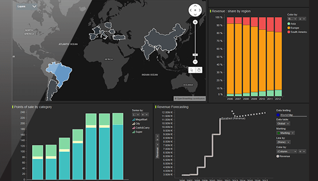
Create a captivating design
A well-designed dashboard can save huge amounts of time, helping your audience quickly identify insights that matter to make effective decisions. But it’s not just about delivering data—it’s about creating a compelling data-discovery environment. Dashboards can be like an artist’s canvas—use this opportunity to create beautiful designs that are visually appealing. Deliver data to your audience in a clear, concise manner, but also engage them to uncover the answers they need.
Collaboration
Effective dashboards need to be shareable and promote collaboration between teams and individual users, enabling active communication and feedback. These shared insights can facilitate user-directed analysis in seconds instead of hours, allowing people to work together and be more productive.
Learn more about Spotfire 7, the data visualization and analytics platform that empowers you to create dashboards that speak to your audience.
Next Steps:
- Register for the ‘What’s New in Spotfire’ webinar.
- Try Spotfire and start discovering meaningful insights in your own data.
- Subscribe to our blog to stay up to date on the latest insights and trends in Big Data and Big Data analytics.


