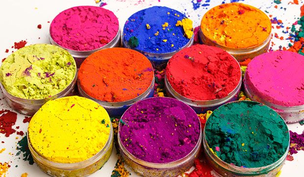
Have you ever wondered about the impact colors can have when you present your ideas in say, a presentation, a flip chart, an infographic, website, or an analytics report or dashboard? Does color make these ideas more well received, or less? Colors affect people differently depending on the subject matter and the applied design, among other things. For example, yellow is often seen as the brightest color in the spectrum and may be associated with happiness and sunshine. However, in other circumstances, it could portray cowardice and deceit. This is a good example of how important it is to consider color selection carefully when creating data visualizations and of course, anticipate the impact of color on the audience.
Let’s review a few examples of how audiences may respond or react to different colors:
- Red – Often associated with attention-grabbing properties, as in red lights or a red carpet, which can invoke both passion and danger. You must be careful using red as a primary design color; it can be intense and overwhelming if not used correctly.
- Blue – May be associated with responsibility or in some context, sadness (read: I’m feeling “blue”). However, using a darker shade of blue in a design can provoke a sense of security. This strong, stable color is a good choice in UI design.
- Yellow – Mostly associated with happiness, sunshine, and raw energy.
- Green – Typically reflects wealth, nature, and renewal. It has a similar sense of security as blue, but with the energy of yellow.
Building data visualizations with a beautiful design can make your audience more receptive, and actually get them to lean in to your insights. With TIBCO’s latest analytics software release, Spotfire 7 you can now create beautiful dashboards that meet your personal or corporate style requirements. For example, new color-scheme options are easily accessible from the menu bar, allowing business users and analytics gurus to select a traditional white color scheme, a new dark version, or create a dashboard with a highly customized look and feel.
This functionality allows you to create an analytics dashboard specifically keeping in mind your ultimate recipients—team members, executives, customers, partners or you. Design with your personal style to create dashboards that are designed to impress, such as in an executive meeting. Implement your corporate style to create a dashboard that matches the look and feel of other corporate applications or web portal.
Colors play an important role in presenting ideas that have a positive impact and drive constructive feedback. Check out the new UI design options available in Spotfire 7 today.
Next Steps:
- Try Spotfire to start creating your own beautiful visualizations and discovering meaningful insights from your data.
-
Register for the “What’s New in Spotfire” webinar.


