There are multiple factors that can impact revenue and earnings growth, including changes in the cost of goods, product demand, and variable and fixed business costs.
While these factors might be apparent to business leaders who track them day in and day out, it can be challenging to communicate the trends that are shaping a business to board members simply by using static bar charts, Gantt charts, and scatter plots.
For example, envision an electronic retailer’s board meeting in which the head of distribution is sharing quarterly distribution costs. Bar charts show how the rising price of fuel has resulted in a 3 percent increase in transportation costs.
The bar chart only tells part of the story. The retailer is undergoing a dramatic transformation in which more than 60 percent of its total inventory is now being delivered directly to stores by vendors. That trend is up 42 percent from the previous quarter and is expected to reach 75 percent by year-end.
The Bar Chart Isn’t Telling You Everything
The forecasted savings generated from reduced warehousing and distribution costs under the new model will more than offset any near-term increases in transportation costs for the retailer’s own fleet. However, this information can’t be explored dynamically in a static bar chart.
Dive Deeper With Data Visualization
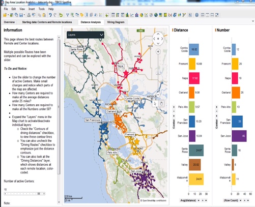
Data visualization tools help participants visualize multi-dimensional business data in a number of different formats: heat maps, fever charts, and other graphical representations.
A heat map could be used to illustrate to board members how customer satisfaction was improved after process changes were implemented. Exploration of data might take on categorical views of these customer segments (e.g., gender, age, customer lifetime value, etc.).
A simple sparkline visualization showing only the trend line, without axes or coordinates, could also be used to illustrate the relationship between customer satisfaction and business performance trends since the process changes.
By visually engaging leadership, you enable them to understand and appreciate potential relationships between operations and results, while fostering a more common business language.
Next Steps:
- Try Spotfire and start discovering meaningful insights in your own data.
- Subscribe to our blog to stay up to date on the latest insights and trends in big data and big data analytics.


